The film calendar for May brings a familiar tension: a few tentpoles dominate attention while a long tail of smaller titles must find clever ways to cut through. Studios frequently avoid direct clashes with the biggest draws — for example, the theatrical arrival of The Mandalorian and Grogu on May 22 — but that strategy can leave odd gaps around holiday weekends. In that environment a single image on a wall or screen becomes a primary tool of persuasion. A successful poster campaign can convert passersby into ticket buyers, and designers are leaning into bold choices to do exactly that.
When we talk about these decisions we are discussing more than decoration. The best sheets use color, typography and composition as signals about genre, tone and audience. Artists are relying on contrasts — neon duotones, single-color washes, or collage stacks — to make a film feel urgent or intimate at a glance. Titles with dates like May 1, May 8, May 15, May 21, May 22 and May 29 show how studios map creative choices to release slots, from limited runs to wide openings and VOD rollouts.
When calendar pressure forces creative risk
With big names such as The Devil Wears Prada 2 on May 1 and action challengers like Mortal Kombat II on May 15, smaller films often pursue bolder visual moves. That means posters are not just promotional assets but tactical disruptions: a VOD title might dare to use surreal imagery to demand attention beside a glossy franchise billboard. For instance, a VOD release can weaponize a single, startling photo or an audacious illustration to create word-of-mouth. The goal is to manufacture curiosity through contrast — the quieter film becomes the visual surprise next to a predictable studio layout.
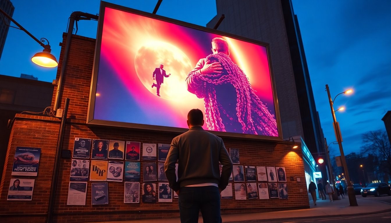
Color, type and framing as storytelling shorthand
Designers often treat the sheet like a short-form narrative. A poster that turns an entire landscape into neon green tells viewers something immediate about mood and theme, while a monochrome blue approach can suggest voyeurism or melancholy. In these cases, color palette operates as shorthand: audiences recognize genre cues without reading a single review. Meanwhile, typography choices — slanted boxes, layered drop shadows, or playful letterforms — can create motion, tension, or whimsy. Such tactics are deliberate: they manipulate where the eye lands and how long it lingers.
Liminal spaces and viral references
Some projects leverage internet-native aesthetics to reach niche fans. A film built around a liminal labyrinth might use the same chevron wallpaper pattern familiar from viral video shorts, producing instant recognition for those already invested in the concept. That recognition functions like a secret handshake: viewers who recognize the motif feel rewarded and are more likely to seek the film. Designers then adapt this imagery into tight character sheets that emphasize claustrophobia and endless repetition, making the poster feel both intimate and infinite.
Portraits, homage and playful pastiche
Other posters choose human faces and retro gestures to invite empathy or nostalgia. A composition with a halftone overlay can suggest memory or distorted perception, while painted portraits channel older cinematic eras and cult sensibilities. Filmmakers may present their work as a love letter to past movements by leaning into color-saturated illustration and exuberant props, promising a joyful or subversive viewing experience. Costume collages and repeated character images create a collage effect that signals costume, disguise and performance as story elements.
Stacked imagery and narrative clues
Another common device is the stacked or scrapbook aesthetic: clippings, tickets, and schematics layered to imply investigation or heist. This tidy chaos can sell both the plot and the sense of community around the film: it looks like an evidence board, but for fans. Refrigerator-lit interiors, shadowed thresholds and unexpected silhouettes offer hints while maintaining mystery. These visual clues act as invitations; a viewer is asked to assemble the narrative puzzle themselves, which increases engagement long before the lights go down.
In a month where marquee names draw the most attention, poster designers are tasked with creating a moment of interruption. Whether through a striking color duotone, a referential wallpaper pattern, a playful illustration, or a meticulous collage, each approach aims to stake emotional or cultural territory. The most effective sheets don’t explain everything — they tease and provoke, nudging potential audiences toward a ticket or a streaming click. As release dates such as May 1, May 8, May 15, May 21, May 22 and May 29 arrive, the visual conversation continues to be as consequential as critics’ reviews or early box-office numbers.