March marketing clash reshapes awards narratives
Studios, marketers and awards voters are at the center of a convergence that is reshaping this awards season. The final weeks of voting coincided with a wave of new releases and streaming rollouts. The overlap intensified competition for audience attention and critical momentum.
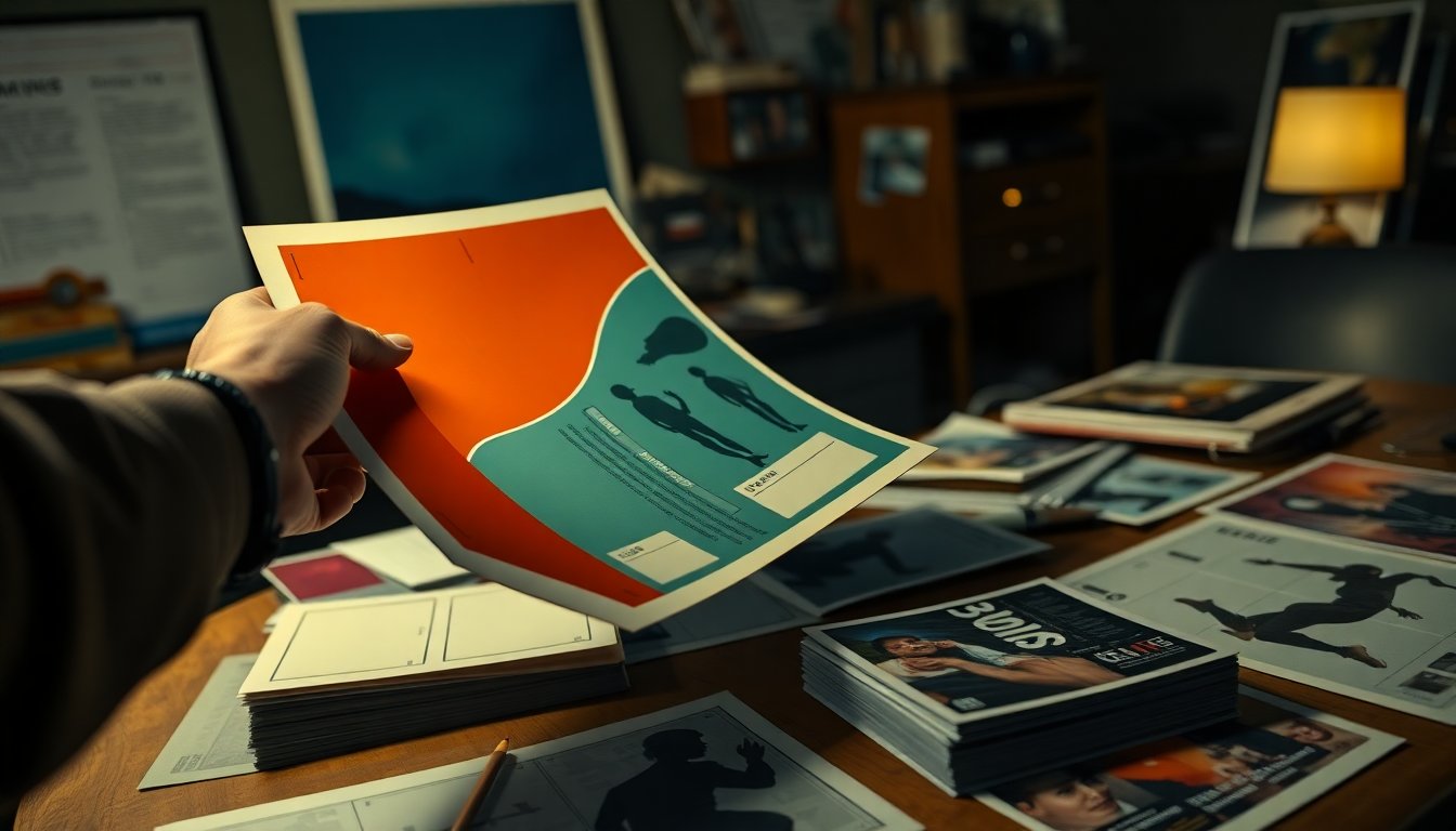
Marketing teams responded with bold visual campaigns. Alternative posters and theatrical one-sheets emphasized mood and character through striking composition and inventive typography. These materials sometimes communicated a film’s tone more directly than trailers.
Simultaneously, late-stage voting shifts altered the field. Final results from actor awards and other precursors produced unexpected momentum for several contenders. Those developments adjusted industry and public predictions for the upcoming Academy Awards ceremony on March 15.
The combination of aggressive marketing and late voting movement changed how cinephiles and industry insiders discussed likely winners. Visual identity influenced perception, while voting dynamics realigned expectations during the season’s decisive stretch.
Design as a last-minute rally cry
Visual identity influenced perception, while voting dynamics realigned expectations during the season’s decisive stretch. Poster art emerged as a rapid-response instrument. It helped shape conversations in the final weeks.
Artists including Alessandro Montalto, Lovas Tibor, Pablo Iranzo, Matt Needle and Idea Oshima produced alt-posters that circulated widely on social platforms. The images relied on illustration, texture and typography to imply tone without revealing plot. The work generated grassroots attention for titles such as Sentimental Value, Bugonia, Marty Supreme and Hamnet.
The power of a single type treatment
Type choices condensed complex signals into a single visual cue. A serif with tight spacing suggested period intimacy. A bold sans serif signalled urgency or irony. Designers used these conventions to cue critics, voters and niche audiences in seconds.
That rapid signaling matters when attention is scarce. Short-form visuals can alter initial emotional framing. From a communications standpoint, a single successful type treatment can increase recognizability across feeds.
Evidence from social circulation shows amplification, though not every campaign translated into awards momentum. The posters functioned as low-cost activism for smaller titles, extending visibility beyond traditional marketing windows.
From the perspective of stakeholders, this trend raises practical questions about equity and influence. Smaller studios can leverage creative design to compete for cultural attention. At the same time, campaigns that convert aesthetic signals into measurable voter impact demand further scrutiny.
Looking ahead, designers and marketing teams will likely refine how typography, texture and imagery target segmented juries and public audiences. The interplay between visual identity and decision-making will continue to shape the season’s narrative.
The interplay between visual identity and decision-making will continue to shape the season’s narrative.
Design choices on recent posters and teasers have moved beyond decoration to become a central argument about a film’s tone and intent. Graphic designers are using typography, texture and compositional negative space to steer interpretation before audiences see a frame.
On the poster for Yes (limited, March 27), a masthead-style title paired with heavy film grain produces a glossy yet tactile look. The designer placed the line “a film by” within the negative space around the director’s name. That decision shifted the poster’s balance in a way that feels deliberate rather than formulaic.
The teaser for The Bride! (teaser out March 6) pursues a related strategy. Heavy grain and letterpress aesthetics make the image read as though it has been physically stamped. The effect aligns the poster’s materiality with the film’s raw energy and urgency.
Images that complicate narratives
These interventions complicate straightforward readings of promotional art. Typography and texture introduce tactile metaphors that can imply authenticity, nostalgia or violence without explicit imagery. Designers therefore shape not only recognition but judgment.
From a visual-analysis perspective, small formal shifts produce outsized interpretive consequences. A repositioned credit line can suggest intimacy or distance. Surface treatments can make fiction feel archival or immediate. Such choices matter to critics, programmers and audiences assessing films ahead of release.
By foregrounding materiality and typographic intent, recent posters invite viewers to read the design as a form of commentary. The result is promotional art that operates on two levels: selling a film and proposing an interpretive frame.
Following that assessment, Sofia Coppola’s one-sheet for Marc (limited, March 20) foregrounds a backstage scene rather than runway spectacle. The image frames a model in a doll-like pose. The pose reads as alternately critical and affectionate toward fashion-world artifice. The restraint in composition invites sustained interpretation rather than immediate spectacle.
When costume and composition provoke
The poster relies on costume and framing to shift emphasis from glamour to construction. A muted palette and tight cropping reduce the figure to an object of study. Costume details—neckline, seam lines, and styling—function as visual clues about identity and performance. The composition encourages viewers to consider how clothing shapes subjectivity within the fashion industry.
From a visual-design perspective, this approach aligns promotional intent with interpretive strategy. The art still sells the film, but it also proposes a critical lens on image-making. By privileging backstage labor over the catwalk, the poster reframes fashion as staged knowledge rather than natural display. This tactic sustains the season’s broader move toward posters that do more than decorate; they steer audience interpretation.
This tactic sustains the season’s broader move toward posters that do more than decorate; they steer audience interpretation. The marketing for two upcoming releases exemplifies that shift.
The one-sheet for Touch Me (limited, March 20) centers on a tightly framed gesture. The actor’s ambiguous expression and the vertical title treatment require viewers to pause. Stacked lettering and a glamorous color grade create a visual tension between pleasure and threat. The design functions as shorthand for a narrative about addiction to an alien sensation, signaling tone before a single line of dialogue is heard.
The teaser for Forbidden Fruits (GrandSon, March 27) adopts a more confrontational approach. The camera pushes into the actor’s face, forcing prolonged scrutiny of details such as blood and metal charms. Close-up intensity converts initial shock into narrative curiosity, inviting questions about motive and backstory.
Art direction as storytelling
Both campaigns use composition and typography to influence viewer expectations. Tight framing compresses emotional space and intensifies uncertainty. Vertical title treatments slow visual scanning and emphasize physicality. Color grading softens or sharpens perceived threat, guiding emotional response.
From a marketing perspective, these choices clear a path for the films’ themes. They prioritize affective cues over expository imagery. That approach aligns with a larger trend of promotional materials operating as interpretive prompts rather than neutral identifiers.
For audiences, the result is a cue-rich invitation to engage. For designers, it marks a deliberate shift: poster art now foregrounds psychological architecture as much as cast or plot. Expect more campaigns this season to deploy similar visual strategies to shape early reception.
Expect more campaigns this season to deploy similar visual strategies to shape early reception. Illustration and handcrafted techniques give marketers direct control over tone. They can signal emotional register and genre in a single image.
Sylvain Chomet’s animated poster for A Magnificent Life ( March 27) favors painterly motion. The tableau of characters and a forward-thrusting car suggests momentum and whimsy. The title’s script uses overlapping strokes to imply depth, echoing the animation’s three-dimensional energy.
Jillian Adel’s scrapbook approach for Dead Lover (limited, March 20) opts for tactile collage. Torn paper, lightning motifs and a severed-finger prop telegraph a lo-fi, Frankenstein-adjacent black comedy. The rough edges and visible adhesives cue handmade authenticity and comic menace.
Paint and absence
Both posters rely on what they omit as much as what they show. Minimal photographic detail invites viewers to supply narrative context. The result is a controlled ambiguity that encourages speculation ahead of reviews.
From a marketing perspective, these choices shape first impressions. Illustration can frame a film as intimate or whimsical. Collage can signal irony and DIY sensibility. Either route narrows audience expectation before the film reaches critics.
Awards momentum and the final ballots
Either route narrows audience expectation before the film reaches critics. Ivana Miloš’s painted poster for Dry Leaf (limited, March 20) continues that narrowing by converting absence into a visual device.
The image is an oil rendering of an overgrown soccer goal. The composition implies a missing subject more forcefully than a literal photograph might. The canvas texture and the way paint appears to climb and partially obscure the credits underline themes of memory and erasure.
From an art-direction perspective, the poster reframes the film’s central mystery. The technique guides early impressions without revealing plot points. Studies in visual perception show that suggestive imagery can bias viewers’ expectations; here, handcrafted illustration performs that function while preserving uncertainty.
The choice also signals a tactical move in festival and awards campaigning. A painted image emphasizes tone and atmosphere. It steers conversation toward mood and theme, rather than plot mechanics, as final ballots begin to coalesce.
Late actor wins reshape academy expectations
Late victories at actor-focused awards have altered industry forecasts as Academy ballots were due before the broadcast on March 15. Guild and critics’ results elevated titles such as One Battle After Another, Sinners, and F1 into stronger contention.
Analysts said the Producers guild awards and Directors Guild Awards often presage the Academy’s choice. Actor-led wins, however, introduced new uncertainty in the final days. Those outcomes compelled voters and pundits to reassess momentum across categories.
Marketing and creative design continued to shape perception during the closing phase of the season. A single striking poster or a surprise awards victory redirected media coverage and social conversation. As final ballots coalesced, perception and late momentum proved decisive in changing predictions.
Why this matters: awards-season narratives influence box office returns, streaming placement and future awards strategy. Studios and distributors adjust campaigns when actor recognition alters the competitive landscape.
From a strategic perspective, the interplay between promotional craft and last-minute wins shows how fluid outcomes remain even after many industry signposts have been set. The awards calendar can still pivot on a single performance or a well-timed campaign.